
Austin Grossman. Soon I Will Be Invincible. Penguin, 2008, UK edition. Cover design by Estuary English. Illustration by Bryan Hitch. (NB: internal design may be Chip Kidd. The internal design is the same in US and UK editions and Kidd designed the 2007 US edition.) Collected 29 March 2010
I chose to look at a number of design elements from this book because of its elaborate design. Apart from its striking cover, the book also uses coloured inside covers, decorated part pages, and includes a glossy colour signature. What I found particularly noteworthy about the design as a whole was its coherent message that functioned parallel to the novel’s content. The comic-book iconography and the cover and internal art of characters from the book as characters on the cover of comic books draw attention to Grossman’s ironic treatment of comic book themes.
Jacket

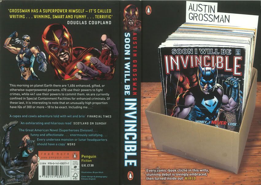
The front cover is matte, with spot gloss only on the cover of the comic book in the art (emulating glossy covers of real-life comic books). Image represents a worn comic-book collection; the title is the title of the comic book, and the author’s name on the index card. Typography is situationally appropriate; the author’s name is in typewriter-esque, old-fashioned typography while the title is in dramatic comic-style typography. Endorsement from Wired magazine (not exactly the last word on fiction). Cover clearly targets a market of comic-book and science-fiction readers, as does the content, with a wealth of in-jokes (for example the character on the novel’s cover closely resembles well-known comic book character Wolverine).
The back cover is matte with spot gloss on the artwork (two characters which clearly represent the book’s two narrators and a third character, who also appeared on the cover.) More comic-book art. Good typography, primary colours (white, blue, yellow) continue to draw on comic-book design.
30 July 2010: I now notice the typography on the spine, which is nice and very readable even from a distance. No space is wasted, the small image at the top is a nice reference to the book's content that will help sell it off the shelf, and it is distinctive and legible.
Internals

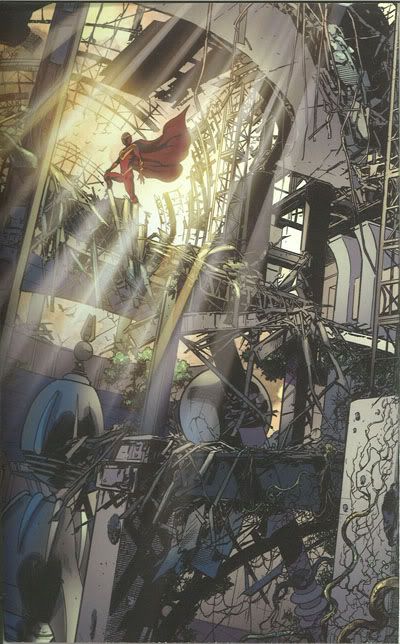
Having left the covers, which are striking but otherwise unremarkable, the elaborateness of the design begins to become apparent. The image above is the inside front cover. It and the inside back cover are printed in colour and feature full-page, comic-book style art.
 
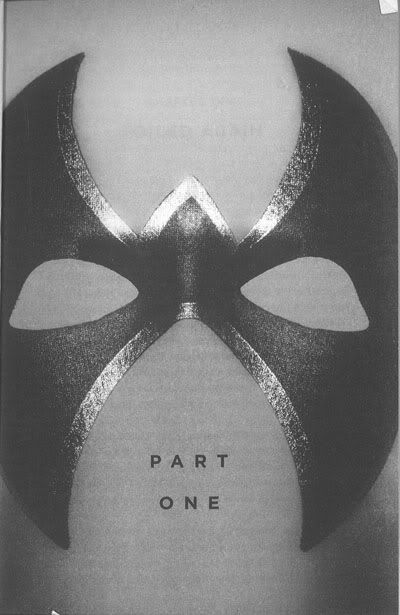
The title spread and part title pages contain more superhero iconography (masks; the Part 3 title page, not pictured, contains an image of a gauntleted fist.) They are just plain striking.

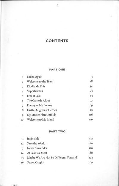
Great title vs text typography: contents page text is in a serifed font (resembling Garamond – not sure what actual font is) while the title page, as well as headers and internal titles, are in a sans serif font (Gotham). Page numbers are away from the spine, in the margin level with the second line of text.
30 July: Although I still like the typography and the white space is nice, I wonder about how far away the page numbers are from the chapter titles now. Like many other books, too, the contents begins on a recto page and carries along on a verso page - but there is very little on the verso page, and I wonder if some of the white space might not have been sacrificed for the utility of having the entire contents on one page.


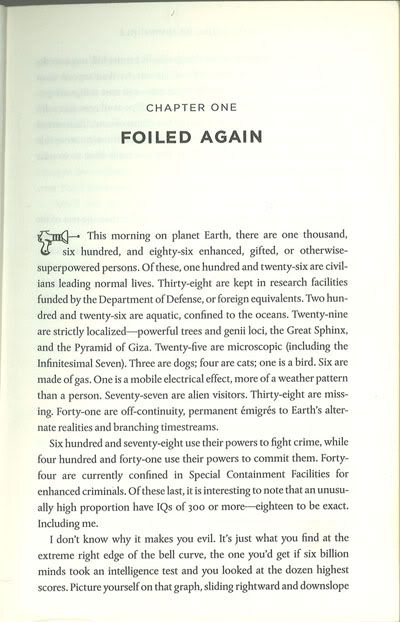
Once more chapter headings are in a nice sans-serif font while text is serifed – These very much resemble standard Penguin fonts. Particular attention should be drawn to the pictograms of a ray-gun and an eye that sit where one would generally expect to see a drop-cap. This is a simple visual representation of the book flipping between its two narrators – the raygun represents Doctor Impossible, the eye Fatale.

The right page is the beginning of an eight-page glossy colour signature that features more comic-book style art – several comic book covers for a fictional title (The Champions) featuring characters familiar from the novel, as well as a spread illustrating a battle from the novel and a spread showing two roughs and then a final pencil sketch of a comic book panel also illustrating a scene from the book (it is from this sketch that the back cover art is drawn.) By featuring the characters on comic books the design forces the reader to come out of the suspension of disbelief that readers of fiction must generally maintain. The characters are immediately contextualised within the cultural field of comic books and must be acknowledged as part of that mythology.
30 July: I continue to really enjoy the design of this book and the way it makes a commentary on the novel as well as working with it. The design is so unified that the book always feels like a whole object that has been produced very lovingly. I notice more things about the typography in retrospect. The unusual placement of the folios works with the book's efficient, slick, slightly science-fiction design; they are large enough to be legible, but are printed in grey so they do not draw the attention, a wise decision considering their position in the side margin. The running headers are legible and clear and I like that they are in a sans-serif font, but I think perhaps the all-caps headers draw the eye a little too much. The bottom margine is relatively small, smaller than the top margin, but perhaps because the folio is not placed down there the small margin doesn't feel like a problem. The text block is large, but the words are spaced such that the text does not feel dense or heavy. |


![[personal profile]](https://www.dreamwidth.org/img/silk/identity/user.png) birdhead's book design blog, created for a class project. Please feel free to follow or leave comments. You can contact me at tui.head(at)gmail(dot)com.
birdhead's book design blog, created for a class project. Please feel free to follow or leave comments. You can contact me at tui.head(at)gmail(dot)com.